This week’s curiosity box explores
1 – Why do people BS?
2 – What goes into a typeface?
1 – Why do people BS?
Bullshit (exclamation, noun)
- complete nonsense or something that is not true.
- Ideas, statements or beliefs that you think are silly or not true
In the world of politics, many have a PhD in bullshitting in every conversation. The sentence you just read is a form of BS in itself. BS is not a subject area, let alone for someone to get a PhD in it.
But here is where it gets interesting. I bet that you agreed to a certain degree to the sentence. What was that the case? BS, in the form of fake news and illogical claims, is happening every day. Unfortunately, even educated folks are susceptible to digesting BS with naivety.
I began my analysis by reading Harry Frankfurt’s On Bullshit. I was shocked to see that this essay had 20 pages on the topic. I have elicited a few points to explain the concept of BS in a nutshell.
Firstly, it is essential to understand a bullshit sentence. You will notice more similarity between a bluff and BS than a lie and BS. A lie is a falsity, and bluff is fakery. The main impetus for someone to resort to BS is when they are put in the spotlight to talk about a subject area they are not experts in.
Secondly, it is easy to BS. If one needs to lie or be honest, one must have a firm conviction over their thoughts. A clear distinction of the truth from the lie is required in both cases: honesty and falsity. However, in the case of BS, one does not need to have any sort of conviction.
Thirdly, people resort to BS rather than lying. The reason here is that people perceive that the perceived punishment for BS is less than a lie.
Lastly, not to forget the listener. BS exists because people listen, acknowledge, and in rare cases, blindly advocates them further. The answer to this problem lies in the sentence itself. People turn a blind eye to the process of verifying for correctness in what they hear. Could this be because it is hard to find accurate information or laziness?
2 – What goes into a typeface (a.k.a. fonts)?
Everything that you read was initially designed by hand. Menu cards, computer screen, signboards, watch surfaces, laundry bills, boarding passes, posters, and the list can go on.
The painstaking process to create a typeface and the different variations can be cramped up within a year or even as long as a decade. Whatever it may be, the devil is the details.
When designers create a typeface, they must be mindful of three elements: overshoot, balance, and contrast.
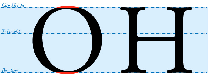
Overshoot is the marginal height difference between rounded letters like C and straight letters like T. C and T might appear to have the same height, but in fact, C is slightly taller than T to give us that effect.
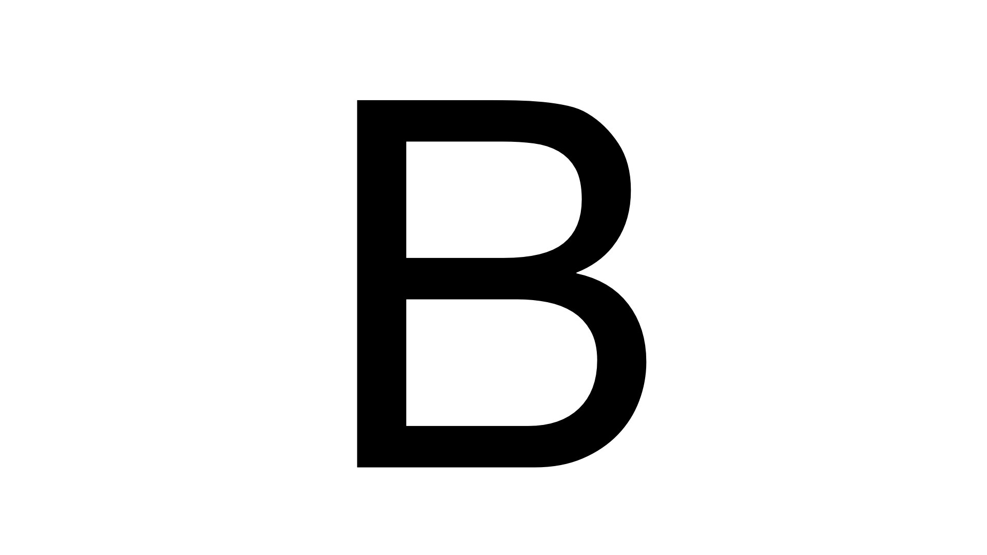
B is the perfect example to explain balance. The top and bottom lines of B might appear to have the same length. But, if you were to tilt the alphabet upside down, the alphabet’s bottom line would be longer than the top. (Go on, turn your phone/laptop upside down and check for yourself)
Contrast is vital in alphabets like T. The horizontal and vertical line might appear to have the same thickness, but if you were to measure it on a ruler, the vertical lines would be thicker than the horizontal.
Then comes kerning and ligature. Kerning is applied to bring some alphabet pairs closer so that the word/sentence becomes easier to read. Ligature’s purpose is also similar to kerning – i.e. to make reading easier. In the case of ligature, alphabet pairs are combined to gather. To see this in action, type the alphabets f and ii using Times font on your computer. The moment you order these two alphabets and hit space, the swoosh on f extends to overshadow the i.
And this is where it gets more interesting.
Finally, designers need to grapple with illusions—three: Poggendorff illusion, Jastrow effect, and optical size.
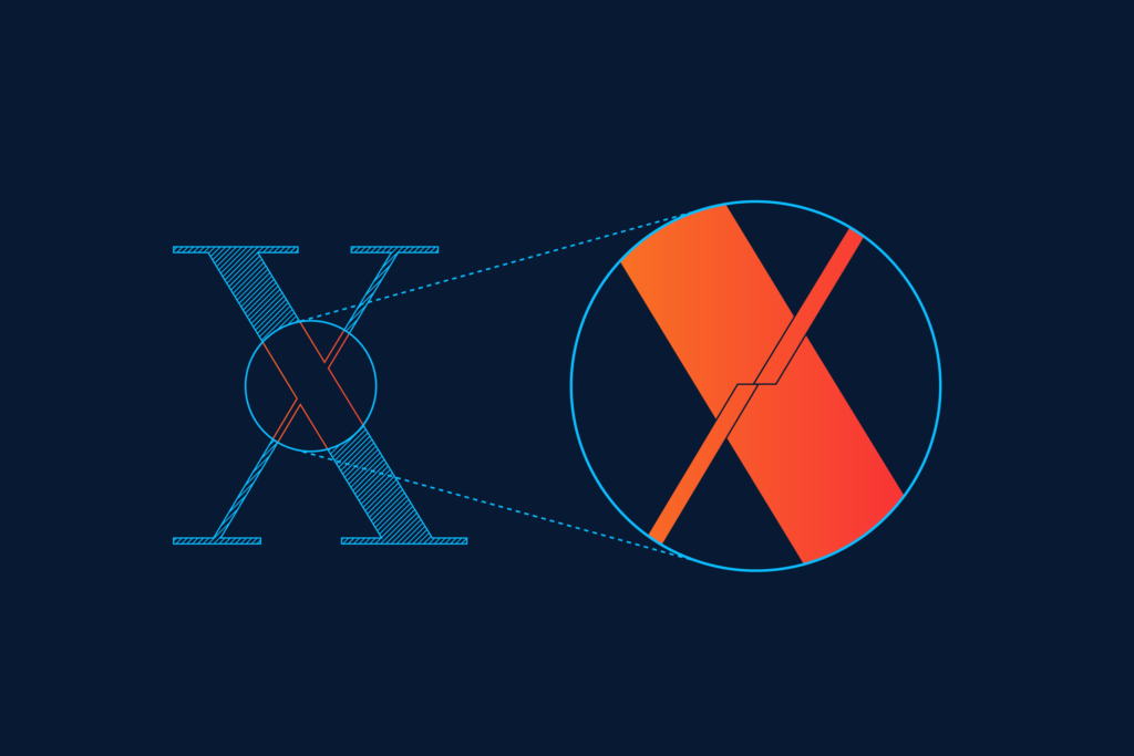
Poggendorff illusion misperception of the position of line segments. It comes into effect where there are straight lines and parallelism. The two-line segments are disjointed but appear aligned.
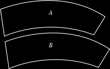
Jastrow’s illusion is applied when designers need to develop quote symbols “. When two curved lines are parallel to each other (left side aligned), the bottom line will appear longer than the top line, even if they are of the same length.
Finally, optical size. Designers play with the thickness of lines and the edges’ sharpness to give a visual effect on the alphabet’s size.
All in all, the complexity that goes into the process has amazed me. The devil is truly in the details.