This week’s curiosity box explores
1 – How to see what’s inside a letter without opening it?
2 – What makes placebos stranger?
3 – Why is the world of logos going flat?
1 – How to see what’s inside a letter without opening it?
A not-so-long time ago, people relied on hand-written letters to send messages. Confidential or not, people didn’t have other efficient options. Without today’s encryption methods, people devised a technique to ensure the message remained confidential and only for the intended eyes.
Letterlocking
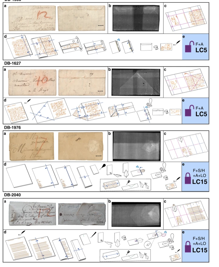
Letterlocking refers to the technique used to fold written letters so that they acted as their own envelop and, consequently, secure the message written inside. Using slits, holes, and adhesives, a person could use hundreds of different ways to lock a letter. Each type of fold has its own way to open it. Anyone without that knowledge would damage the letter and naturally the message it.
However, this ingenious technique has proven to be a pain for historians. As these letters are over a hundred years old, an attempt to open them will permanently destroy the whole letter.
But technology has somehow allowed people to read the message without having to open it.
Using computation flattening algorithms, scientists have found a way to open up 300-years old letters virtually without having to physically open them. Using a scanning method called X-ray Micro Tomography (XMT), the sealed letters are scanned first. Later different layers are identified – written message, air, just paper – and segregated. Points in the minute volumetric space are picked out to act as reference points while flattening the 3D space onto the 2D space. And now you face the letter opened and folded out, ready for the readers eyes to pry the message inside.
A bit complex… but you can find the code here: https://github.com/UnlockingHistory/virtual-unfolding/
2 – What makes placebos stranger?
A chapter in Bad Science explores the placebo effect. Often referred to as a bizarre and enlightening field of research, the placebo effect questions the relationship between the brain, mind, and the body. It remains a mystery despite many years of research.
The word placebo stems from the Latin word placere, which means “to please”. A placebo, in essence, has no active ingredients that can cure a disease and is given as a substitute to the patient. The patient, however, would not know about the replacement. In many instances, physicians have been astonished to find that the substitute worked fine, and in some cases, better. The main reason why placebos came into effect was to satisfy patient demands and their minds. In many cases, simple sugar pills were given to act as a placebo for real medicine.
Here are some more facts about the placebo effect that would raise your eyebrows.
- A study found that patients found having 4 sugar pills more effective than 2.
- Students found pink coloured pills better than blue coloured ones to keep them stimulated for long lectures. Again, pink or blue, they were just sugar pills.
- The size of the pill matters. The bigger the pill, the better the performance. In some cases, people perceived capsules to be better than pills.
- Patients think that if the medication procedure is effective if they are complex and elaborate.
- The brand effect plays importance in the world of medicine—the better packed and more admirable the box, the better the performance.
- The more expensive a medicine, the better the perceived effect.
- Irrespective of the actual medicine, patients respond to treatments better if doctors exhibit more confidence.
- And finally, in an extreme scenario, a chemical drug to induce nausea had the opposite effect just because the patient’s expectations were manipulated before the drug was administered.
3 – Why is the world of logos going flat?
A recent trend I picked up while glancing through the web was that almost all 3-D logos and icons are replaced by their flat 2-D equivalents. From tech companies to the creative arts, the flat is the way forward. But the exciting thing to note here is that 2-D logos are not new. Most of these companies actually started off with 2-D logos.

So why the journey from 2-D to 3-D and now back to 2-D.
With the advent of digital screens, the technology was not advanced enough to have different shades of colours to show a 3-D picture. Most screens were simple black and white pixels. However, as tech advanced, screen resolutions improved, and companies had the luxury of having 3D logos. There was also a human psychology reason why 3D logos and icons were needed.
User Experience (UX) designers have taken the role to ensure that we, as users, comfortably adopt new technology. Back in the day, when we had actual buttons to press and switches to toggle, we received a response whenever we took action. The answer could be by touch, sound, and sight. When screens were introduced, tech companies worried that we may not necessarily adopt these changes well. Using little animations and colour contours, buttons and icons had a 3D effect to it so that we, as consumers, adapted well. The term that defines this process is called skeuomorphism.
But then Apple changed the trend by going back to 2D during Sep 2013 with iOS7. 2D gave designers more space to play around with, and we became more adept at the new way of interacting with buttons. Other companies cite reasons such as simplicity, going green, and what not to justify why they are going flat from an alternative perspective.
Interesting..